Welcome to the Sign Design Society
The Sign Design Society (SDS) is for anyone interested in information and graphic communication within buildings and public spaces, including:
- Wayfinding
- Interpretative graphics
- Brand and experiential/environmental graphics
- Statutory and health & safety signs
As well as raising the profile of our disciplines, we offer members a programme of events, resources and initiatives to help them:
- Keep up to date and improve their practice
- Find potential consultants, collaborators & employees
- Promote their work and capabilities
To join choose a membership plan that suits you and sign up!
Our events
There are no future events.
Interested in a membership?
News
Third party events
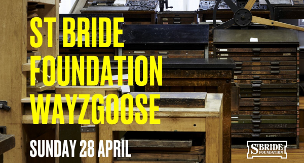
Join St. Bride Foundation to celebrate all things letterpress, with stalls selling letterpress supplies, prints, type specimens and more.
Whether working for transport systems, cultural institutions or global events, Mima creates experiences, places and processes that are driven by human behaviour and accessible to all. In this talk, Mima’s Head of Accessibility and Inclusive Design, Emily Yates, will share case studies as well as hints and tips on how to bring further inclusivity into the world of design.
Join over 2,000 passionate attendees from museums, galleries, heritage sites, and cultural attractions worldwide. Come along and immerse yourself in a world of knowledge exchange, learning, and networking. Dive into vibrant discussions, leave brimming with fresh ideas, and feel inspired by the best.
More information to follow soon.
The main theme of the conference is Resilient Navigation. While the 20th Century was focussed on the provision of ubiquitous and accurate Positioning, Navigation and Timing (PNT), the 21st Century’s focus has shifted to ensuring that PNT services may be trusted and are reliable and resilient. As we move to more and more systems that are either fully automated, or are automated to the point of human complacency, there is now wide recognition of the need for PNT systems that will operate in unprecedented threat-challenged environments (both civil and military); continuously provide usability and integrity status; fail very rarely; and when they do fail, do so safely, securely and elegantly.
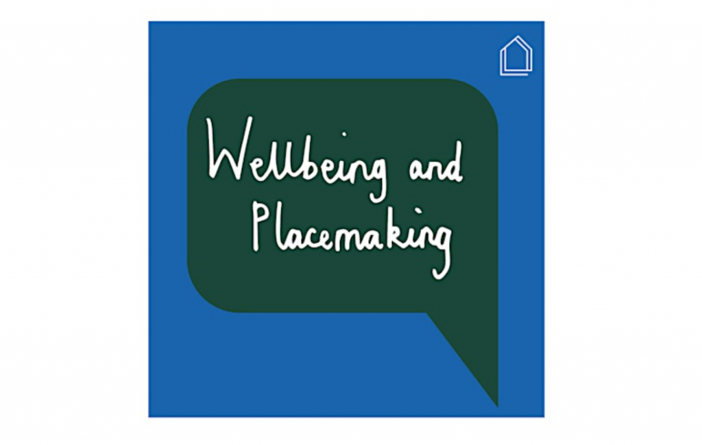
What impact does wellbeing have on citizens’ ability to support placemaking initiatives and to participate as members of society more generally? Wellbeing can be typically defined as the state of feeling healthy and happy, so how can the journey of placemaking be a way to further support the wellbeing of citizens? And how can wellbeing be a more integral part of placemaking? This Chat will explore designing for wellbeing and how placemaking can support the wellbeing of all earthly inhabitants.
This conference (in English) brings together graphic design and typography enthusiasts. We seek to explain how typography has a visible impact on the world around us. Come to Paris to listen a mix of inspiring speakers evoking topics as broad as graphic design, web design, motion design, publishing, visual identity, communication and type design.
Project for Public Spaces’ International Placemaking Week seeks to bring together practitioners, policymakers, and public space advocates from around the world to share the projects and innovations that are making placemaking one of the most critical movements of the 21st century. We want to hear about your experience, stories, tools, and lessons to understand how placemaking can help address local and global challenges!
Presented by the Project for Public Spaces and co-hosted by the Neighbourhood DesignCentre. #PlacemakingWeek attendees will be able to join breakout sessions on everything from activating vacant lots to unlocking the potential in play spaces… & much more! More information coming shortly.
Join us for the inaugural lectures of UCL Institute for Environmental Design and Engineering (IEDE) Professor Anna Mavrogianni and Professor Nici Zimmermann. Anna Mavrogianni is Professor of Sustainable, Healthy and Equitable Built Environment at UCL Institute for Environmental Design and Engineering. There she leads the Research Theme on Temperature, Moisture and Air Quality. With a background […]